
Colour Theory
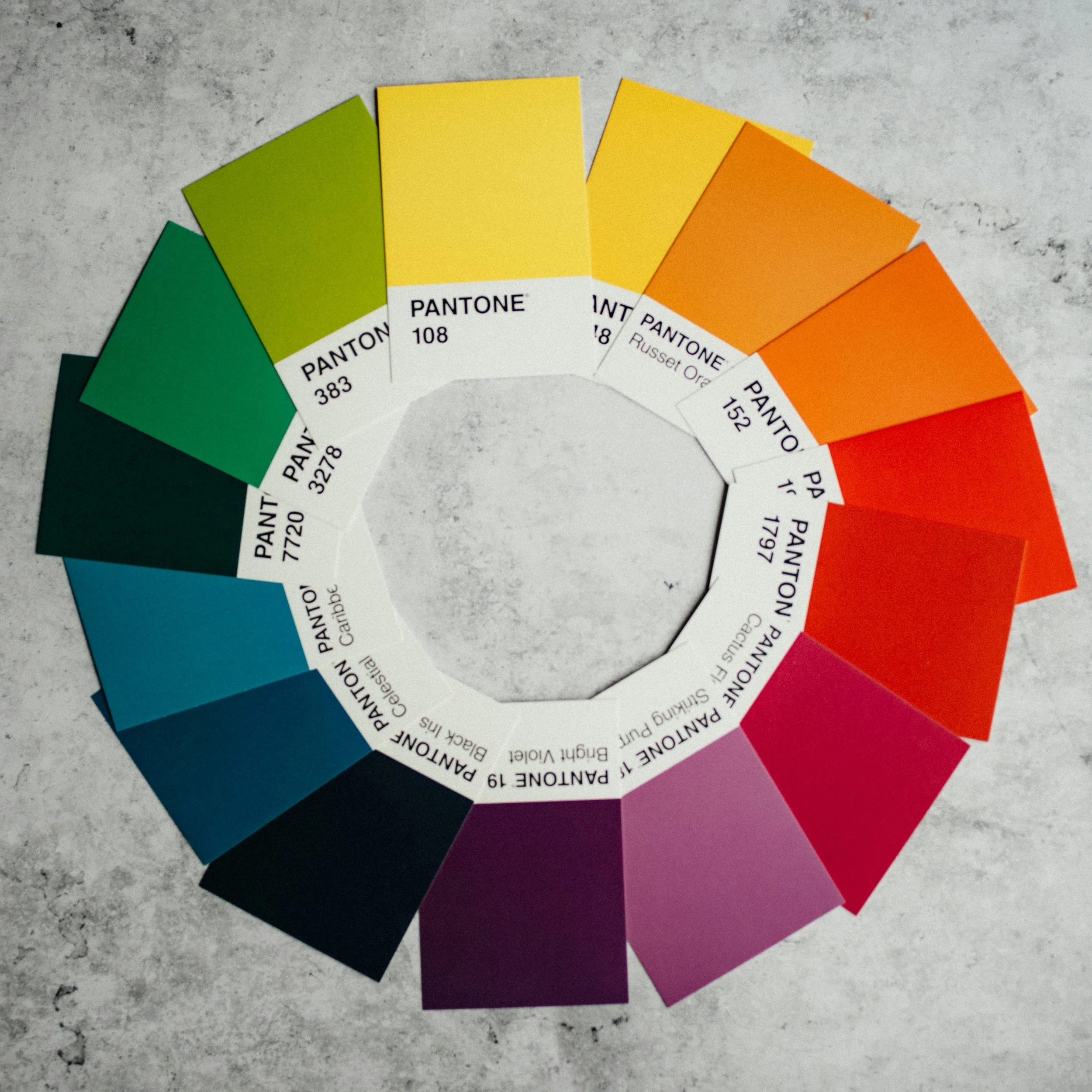
How do interior designers know what colours to use? It’s colour theory! The basis of colour theory starts with the colour wheel. This graphic shows the relationship between colours. The colour wheel starts with the 3 primary colours: red, yellow and blue. All other colours stem from these colours. Between the primary colours you will find the secondary colours orange, green and purple. Next would be the tertiary colours which mix secondary and primary. Yellow-orange or blue-green for example.
Certain colours bring out certain qualities in others. For example orange and blue are opposite eachother on the wheel which is what is known as complementary colours. When placed beside each other complementary colours appear more vibrant. This is known as a complementary colour scheme. Let’s take a look at the most common colour schemes used in interior design.
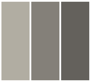
Monochromatic
A monochromatic scheme is made up of one colour and various shades of that colour. These schemes can make a space feel simple and calm.
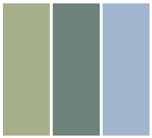
Analogous
An analogous scheme is made of of colours that are beside each other on the colour wheel. An example would be green, blue-green and blue. Analogous schemes will make your space feel harmonious.
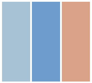
Complementary
As mentioned above complementary schemes consist of 2 colours that are opposite the colour wheel. This scheme will create interest in a space.
Split Complementary
A split complementary scheme is made of one colour and the colours beside its complement. For example blue, orange-yellow and orange-red. A split complementary scheme brings harmony and interest. It softens tension that can be caused by complementary.
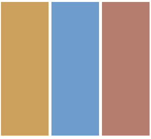
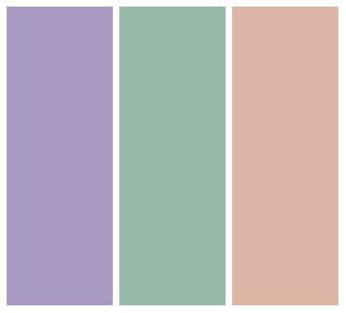
Triadic
A triadic colour scheme consists of 3 colours equally distanced from one another on the colour wheel. An example would be purple, green and orange. A triadic colour scheme creates balance while creating a vibrant aesthetic.
When deciding which colour to be your jumping off point also consider colour psychology. Colour psychology is the study of how certain colours can trigger certain emotions. Though this can vary from person to person generally blue is calm and peaceful. Green is calm and soothing. Yellow is happy and warm. Orange is energizing and fun. Red is intense and aggressive. Purple is luxurious and magical.
Its not just guess work, Interior designers spend years studying design theory and colour theory to gain a comprehensive understanding of the built environment and to create spaces where people can thrive. Interior Ethos is a professional design service that is ready to help with your next design project. Check out our services today!